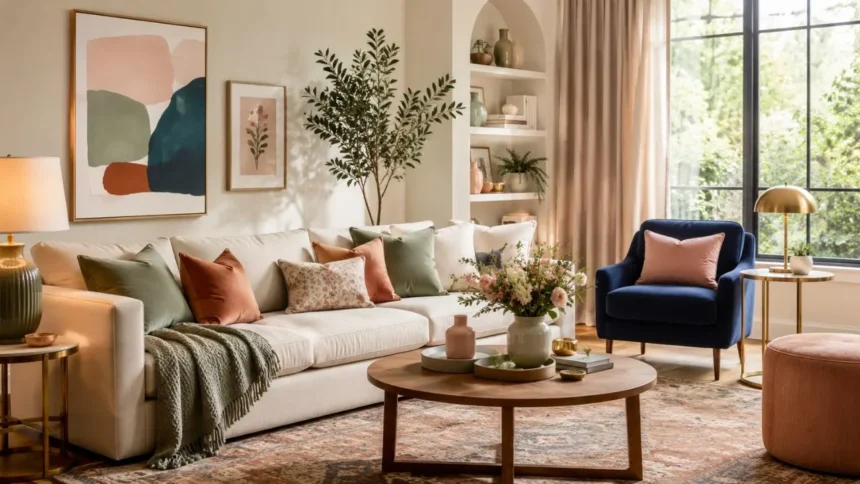
The best color combinations for living room decor make the space feel connected, comfortable and visually balanced. A successful palette does more than make the walls look attractive. It brings together the sofa, curtains, rugs, lighting, artwork and decorative accessories so the entire room feels intentionally designed.
Choosing living room colors can feel difficult because a shade that looks beautiful on a small sample may appear completely different across four walls. Natural light, artificial lighting, flooring and furniture all influence how a color is perceived. The same beige may appear creamy in one room and unexpectedly grey in another.
You do not need to follow every interior design trend or fill the room with several bold colors. Most attractive living room color schemes begin with one dominant shade, one supporting tone and a carefully selected accent. This gives the space personality without making it feel crowded or visually confusing.
This guide explores stylish wall and furniture combinations for modern, traditional, small and family living rooms. It also explains how to work with undertones, room size and natural light. Whether you prefer calming neutrals or richer statement shades, these ideas can help you create a cohesive living room palette.
How to Choose a Living Room Color Combination
Begin by identifying the elements that will remain in the room. Flooring, a large sofa, built-in cabinetry and expensive curtains are usually harder to replace than cushions or paint. Use the undertones in these permanent pieces as the starting point for your living room color palette.
Next, consider how you want the room to feel. Warm neutrals, clay shades and earthy greens can create a relaxed atmosphere, while crisp white, navy and charcoal may feel more structured. Soft blues and pale neutrals can make the room feel airy, whereas deeper colors produce a more intimate effect.
Pay close attention to natural light. Bright, south-facing rooms can usually handle stronger or cooler colors, while darker rooms may benefit from warm shades that prevent the space from feeling gloomy. However, a deliberately deep color can also make a low-light living room feel rich and cocooning.
Collect paint samples, fabric swatches and photographs of your existing furniture before making a decision. Compare them together rather than choosing each item separately. A coordinated mood board helps reveal whether the colors share compatible undertones and whether one shade is overpowering everything else.
1. Warm White, Beige and Black
Warm white and beige create a soft neutral foundation that works with many decorating styles. Use warm white on the walls and introduce beige through a sofa, large rug or upholstered chairs. The subtle difference between the two shades adds depth without making the room look busy.
Black provides the definition that pale neutral rooms sometimes lack. Introduce it through slim furniture legs, curtain rods, picture frames or a modern floor lamp. These smaller dark details create contrast and help the lighter colors appear cleaner and more intentional.
Natural textures make this color combination feel warmer. Linen curtains, woven baskets, wool cushions and pale wooden furniture prevent the room from looking like a plain white box. Layering several textures is particularly important when most of the palette consists of similar neutral shades.
This combination suits modern, Scandinavian, minimalist and transitional living rooms. Choose creamier whites when your beige furnishings have yellow or golden undertones. A cooler white may clash with warm upholstery and make an otherwise coordinated room feel slightly disconnected.
2. Cream, Terracotta and Olive Green
Cream, terracotta and olive green create an earthy living room color scheme inspired by natural landscapes. Cream keeps the room open and comfortable, while terracotta introduces warmth. Olive green balances the red-orange tones and gives the palette a calmer, grounded appearance.
Use cream as the main wall color when you want a flexible background. Terracotta can appear through cushions, pottery, artwork or one upholstered chair. Olive works beautifully on curtains, a feature wall or a velvet sofa when you want the green to play a stronger role.
Medium and dark woods complement this combination particularly well. Walnut tables, oak shelving and woven rattan pieces reinforce the natural character of the scheme. A few aged-brass accessories can add gentle brightness without competing with the warm, organic colors.
Avoid using highly saturated orange and bright green together, as the result may feel too energetic for a relaxing living room. Choose softened, slightly muted versions of terracotta and olive. Their dusty undertones allow the colors to feel sophisticated rather than overly themed.
3. Sage Green, Warm White and Natural Wood
Sage green is a versatile choice for homeowners who want color without committing to an intense shade. It sits comfortably between green and grey, producing a restful effect. Warm white keeps the room fresh, while natural wood prevents the palette from becoming too cool.
Sage can be used across all the walls or limited to one focal area behind the sofa. Warm white trim and ceilings create a gentle contrast that defines the architecture. Oak furniture, wooden picture frames and woven accessories add warmth and connect the room with nature.
This combination works well with beige, oatmeal and light grey upholstery. Add darker green cushions or botanical artwork when the space needs more depth. Small touches of black can also create structure, particularly in a contemporary living room with simple furniture shapes.
Test sage carefully because its undertone can change significantly throughout the day. Some versions appear silvery in cool light, while others look warmer and more yellow. Place a large sample beside your sofa and flooring before covering the entire room.
4. Navy Blue, White and Camel
Navy blue, white and camel create a polished color combination that feels both classic and modern. Navy adds depth, white creates contrast and camel introduces warmth. Together, they produce a living room that feels sophisticated without becoming cold or overly formal.
Use navy on a feature wall, built-in shelves or a large sofa. White can cover the remaining walls, ceiling and trim, allowing the darker blue to stand out. Camel leather chairs, tan cushions or a warm brown rug soften the contrast and make the space more welcoming.
Brass, antique gold and warm wood accents complement this palette naturally. A brass lamp or wooden coffee table can connect the camel furniture with the navy background. Cream textiles are also useful when pure white feels too sharp for the room.
This scheme can make a small living room look dramatic rather than cramped when the lighting is planned carefully. Include several lamps and reflective surfaces to prevent dark corners. Keeping the floor and larger textiles relatively light also helps balance the visual weight of navy.
5. Soft Blue, Greige and Brass
Soft blue and greige create a peaceful living room palette with more personality than an entirely neutral scheme. Greige combines grey and beige, allowing it to connect cool blue with warmer furniture. Brass adds controlled warmth and keeps the combination from feeling flat.
Use greige on the walls and bring soft blue into curtains, cushions, artwork or an upholstered chair. Alternatively, pale blue walls can provide a calm background for a greige sofa. The best arrangement depends on which color works more naturally with the flooring and available light.
Choose a blue with a muted grey undertone rather than a bright pastel. Dusty blue, misty blue and blue-grey shades usually feel more refined in adult living spaces. Polished or aged brass can then appear through lighting, frames, cabinet handles and decorative objects.
This combination is particularly effective in coastal, transitional and modern-classic interiors. Avoid adding too much cold grey, which may make the space feel uninviting. Warm wood, cream textiles and soft lighting maintain the comfortable atmosphere needed in a living room.
6. Taupe, Chocolate Brown and Ivory
Taupe, chocolate brown and ivory create a rich neutral palette that feels warmer than conventional grey. Taupe provides a flexible middle tone, while chocolate adds depth. Ivory lifts the darker colors and prevents the living room from feeling heavy or enclosed.
Consider taupe walls with an ivory sofa and dark brown wooden furniture. Chocolate can also be introduced through a velvet chair, large rug or painted shelving. Repeating the dark shade in several smaller locations helps it feel connected rather than isolated.
Texture is essential in a brown living room color scheme. Bouclé, velvet, leather, wool and natural wood reflect light differently, creating interest within the limited palette. Without these variations, multiple brown and beige shades may blend into a flat, undefined space.
Add small amounts of rust, burgundy or muted green when you want an accent color. These shades share the earthy character of the main palette and will not disturb its calm appearance. Keep bright primary colors limited unless deliberate contrast is part of the design.
7. Dusty Pink, Burgundy and Warm Beige
Dusty pink has enough softness to function almost like a neutral, particularly when it contains brown or grey undertones. Paired with warm beige, it creates an inviting background. Burgundy adds depth and prevents the room from feeling overly pale or delicate.
Use dusty pink on the walls or through a large upholstered item. Beige sofas, rugs and curtains can keep the overall space balanced. Introduce burgundy through cushions, artwork, a footstool or a single statement chair rather than applying it everywhere.
Dark wood and antique brass suit this palette beautifully. Walnut tables, traditional picture frames and warm metallic lighting can make the colors feel established and elegant. Contemporary furniture can also work when its shapes are simple and the accessories remain controlled.
The key is choosing muted shades rather than sugary pink and bright red. Look for plaster pink, rose beige, oxblood and wine tones. These deeper, earthier versions create a mature living room color combination suitable for both traditional and modern interiors.
8. Charcoal Grey, Warm White and Mustard
Charcoal grey creates a strong foundation for a modern living room, but it benefits from lighter and warmer supporting colors. Warm white provides contrast, while mustard introduces energy. The result feels bold and contemporary without depending on several competing shades.
Use charcoal on one wall, cabinetry or a large sofa rather than automatically covering every surface. Warm white walls and ceilings maintain brightness. Mustard cushions, throws or artwork can then become the controlled accent that gives the neutral room a clear personality.
Light and medium wood furniture softens the industrial character of charcoal. Oak, cane and woven fibres create warmth, while matte black accessories maintain a modern edge. A cream or patterned rug can connect the pale walls with the darker furniture.
Mustard is a powerful accent, so a small quantity is usually enough. Repeating it two or three times across the room creates balance without overwhelming the palette. Softer ochre may be a better choice when bright mustard feels too energetic for your taste.
9. Teal, Rust and Cream
Teal and rust sit on contrasting sides of the color wheel, allowing each shade to strengthen the other. Teal provides cool depth, while rust brings warmth. Cream gives both colors enough breathing space and keeps the living room from becoming overly dramatic.
A teal sofa can become the main feature against cream walls. Rust cushions, patterned curtains or an accent chair can then provide contrast. Alternatively, use teal on the walls and choose cream upholstery with smaller terracotta or rust-colored decorative pieces.
Dark wood, brass and warm neutral rugs work especially well with this combination. Plants can also reinforce the green undertone in teal without introducing an unrelated color. Keep the accessories restrained so the two main statement colors remain easy to appreciate.
Choose muted teal and earthy rust rather than highly saturated turquoise and orange. Softer versions feel more suitable for everyday living and are easier to coordinate with existing furniture. Patterned textiles can include both colors and help unify the complete scheme.
10. Black, White and Natural Wood
Black and white create immediate contrast, while natural wood prevents the room from feeling severe. This classic combination suits modern, minimalist and industrial interiors. It can also work in traditional spaces when black appears through painted joinery, frames and furniture details.
Use white or soft off-white across the largest surfaces to maintain brightness. Black can define doors, shelving, fireplaces or window frames. Wood should appear through coffee tables, flooring, sideboards or decorative objects so warmth is distributed throughout the room.
Avoid dividing the space into large, disconnected blocks of pure black and white. Introduce soft transitions through grey textiles, cream rugs and patterned fabrics. These middle tones make the contrast more comfortable and help the living room feel layered rather than graphic.
The wood undertone should suit the rest of the home. Pale oak creates an airy Scandinavian effect, while walnut adds richness and formality. Repeating the same or similar timber finishes prevents the room from looking like several unrelated furniture collections.
Best Color Combinations for a Small Living Room
A small living room does not need to be completely white. Pale greige, warm cream, muted blue and soft sage can create openness while adding personality. Keeping the walls, trim and larger furniture within a related tonal family reduces visual interruptions and makes the space feel more continuous.
Warm white with beige and pale oak is one of the safest combinations for a compact room. Soft blue with ivory can create a fresher look, while sage with cream adds gentle color. Use darker tones through small accents rather than several large pieces competing for attention.
Matching curtains closely to the wall color can make the room appear taller and less divided. A rug large enough to sit beneath the main furniture also creates a more unified floor area. Several small rugs may visually break the room into even smaller sections.
Dark colors can still work when you prefer a moody interior. Deep blue, charcoal or chocolate walls can blur boundaries and create an intimate atmosphere. Balance them with good lighting, pale upholstery and fewer decorative objects so the compact space does not feel cluttered.
Best Colors for a Bright and Airy Living Room
Warm white, soft cream, pale beige and light greige reflect available light and create an airy background. These shades work particularly well when combined with sheer curtains and natural materials. However, the room still needs contrast to avoid appearing washed out.
Introduce pale blue, sage or dusty pink through soft furnishings for gentle variation. A medium wood coffee table and a few black details can provide structure. This combination keeps the room bright while preventing every surface from blending into the same light tone.
Mirrors and reflective accessories can move light around the room, but they should support rather than replace good lighting. Position lamps at different heights and include warm bulbs in seating areas. A bright room should still feel comfortable during the evening.
Choose washable or durable fabrics when the living room is used frequently by children or pets. A bright palette does not require a pure white sofa that creates constant worry. Oatmeal, light taupe and textured beige can deliver the same airy feeling with greater practicality.
Best Colors for a Cozy Living Room
Cozy living rooms often use warm, enveloping colors such as chocolate brown, terracotta, olive, burgundy and deep blue. These shades visually bring surfaces closer and make a large room feel more intimate. Layered lighting and tactile fabrics strengthen the comforting effect.
Choose one deep color as the main feature rather than combining several unrelated dark shades. Chocolate walls can pair with cream furniture, while navy works with camel and warm white. Olive can be balanced with beige, walnut and muted rust.
Velvet, wool, boucle and brushed cotton make a cozy palette feel richer. Curtains that reach the floor, a generously sized rug and several lighting sources also contribute to comfort. Color alone cannot create warmth when the room lacks texture and appropriately placed light.
Avoid making every element dark. Pale lampshades, cream cushions and a lighter ceiling provide visual relief. This contrast allows the deeper colors to feel intentional and luxurious instead of making the space appear smaller and poorly lit.
Use the 60-30-10 Color Rule
The 60-30-10 rule is a simple way to organise a living room color scheme. Approximately 60 percent of the space uses the dominant color, 30 percent uses a secondary shade and 10 percent introduces an accent. The proportions are flexible rather than strict mathematical requirements.
The dominant shade commonly appears on walls, large rugs or major furniture. A secondary color may cover the sofa, curtains and occasional chairs. The smallest accent can appear through cushions, artwork, lamps and decorative objects distributed around the room.
For example, a room could use warm white as the dominant color, camel as the secondary shade and navy as the accent. Another scheme might combine sage walls, cream furniture and rust-colored accessories. The rule helps each color receive a clear role.
You can also create a more layered variation using several shades from the same family. Light beige may dominate, taupe can support it and chocolate brown can provide the accent. This tonal approach feels calm while still giving the room enough contrast and definition.
Match Colors With Your Sofa
A sofa is usually one of the largest visual elements in a living room, so its color should influence the complete palette. When the sofa is already present, use it as the starting point rather than selecting wall paint independently. Consider both its main color and its undertone.
A grey sofa can work with soft blue, warm white, sage or blush walls, depending on whether the grey is warm or cool. Beige sofas pair naturally with olive, terracotta, navy and cream. Brown leather works particularly well with blue, green and warm neutral walls.
A colorful sofa needs enough neutral space around it. Teal, rust, green or navy upholstery can become the room’s main statement, allowing walls and rugs to remain quieter. Repeat the sofa color subtly in artwork or patterned cushions to make it feel integrated.
Do not attempt to match the wall exactly to the sofa unless you are intentionally creating a tonal room. A slight difference in depth or undertone usually provides better definition. Place paint samples directly behind the sofa before deciding whether the combination works.
Coordinate Walls, Curtains and Rugs
Walls, curtains and rugs cover large visual areas, so they should communicate with one another. They do not need to match, but they should share compatible undertones. A warm cream wall may clash with an icy grey rug even when both are technically neutral.
Curtains close to the wall color create a calm, continuous appearance. Contrasting curtains can become a feature, but they should connect with another element such as the sofa or rug. Repeating the curtain color in two or three smaller details makes the choice feel deliberate.
A patterned rug can provide the foundation for the entire palette. Select two or three colors from its design and repeat them through cushions, artwork and accessories. This approach is particularly useful when you feel unsure about choosing accent colors independently.
Choose the rug before finalising small decorative items because it is more expensive and difficult to replace. Make sure it is large enough to connect the main seating pieces. A coordinated palette feels stronger when the furniture arrangement is visually grounded.
Understand Warm and Cool Undertones
Every neutral color carries an undertone that may become more visible once it is placed beside another shade. Beige may lean yellow, pink or grey, while white may appear creamy, blue or green. These differences explain why two individually attractive colors may look uncomfortable together.
Warm undertones generally include yellow, red, peach and brown. Cool undertones may include blue, green or violet. A room does not need to contain only warm or only cool colors, but one temperature should usually dominate while the other provides controlled contrast.
Examine samples beside the flooring, sofa and curtains because these large items can reveal hidden undertones. A warm grey may look neutral in the shop but appear purple beside a yellow-beige carpet. Testing prevents expensive repainting and disappointing furniture purchases.
Natural and artificial light also affect undertones. Observe samples in the morning, afternoon and evening before making a decision. Paint a large movable board when possible so you can compare the shade on different walls without covering the entire room.
Common Living Room Color Mistakes
Choosing paint before considering the furniture is one of the most common mistakes. Thousands of paint shades are available, while sofas, flooring and rugs offer fewer choices. Select the harder-to-change items first, then find a wall color that connects them.
Using too many accent colors can make the living room feel unsettled. Limit the main palette to two or three shades and allow patterns to introduce smaller variations. Repetition is what turns separate furniture and decorative objects into one cohesive interior.
Ignoring lighting can also produce disappointing results. A color selected in a brightly illuminated showroom may appear dull or much darker at home. Large samples and several days of observation provide a more accurate impression than a small printed color card.
Following trends without considering personal taste creates a room that may quickly feel uncomfortable. Use fashionable shades through paint or accessories only when you genuinely enjoy them. A successful living room should reflect the household rather than looking like a temporary showroom display.
How to Test a Color Combination Before Decorating
Begin with physical samples rather than relying entirely on a phone or computer screen. Digital colors vary according to screen settings and cannot reproduce the exact paint finish. Obtain real paint cards, fabric swatches and flooring samples whenever possible.
Paint large sample boards and move them around the living room. Place them beside the sofa, behind the television and near the windows. Observe the color during bright daylight, cloudy conditions and artificial evening lighting before reaching a final decision.
Arrange possible cushion fabrics, curtain materials and rug samples together. Take a photograph and temporarily remove any option that dominates the group. The goal is not to make everything match, but to ensure the pieces feel connected through color or undertone.
Live with the proposed palette for several days. A shade that appears exciting for five minutes may feel tiring across a large wall. Taking time at the testing stage is usually easier and less expensive than correcting an unsuitable combination after the room is finished.
Final Thoughts
The best color combinations for living room decor balance personality with practicality. Warm white and beige create a flexible foundation, while navy and camel offer classic contrast. Sage and natural wood feel restful, and richer combinations such as teal with rust create a more expressive interior.
Begin with permanent features such as flooring, sofas and built-in furniture. Identify their undertones and use those clues to select paint, curtains and rugs. This method produces more reliable results than choosing a fashionable wall color in isolation.
Use one dominant shade, one secondary color and a controlled accent to create visual order. Repeat each important color in several locations and introduce texture through fabric, wood and natural materials. These details help even a simple neutral palette feel complete.
Most importantly, test every major color in the actual room before purchasing large quantities. Light can transform a shade throughout the day, and existing furniture may reveal unexpected undertones. Careful testing leads to a living room that feels coordinated, comfortable and genuinely personal.
Frequently Asked Questions
What Is the Best Color Combination for a Living Room?
Warm white, beige and black form a versatile combination that suits many interiors. Sage with cream or navy with camel are excellent choices when you prefer more color.
Which Two Colors Work Best Together in a Living Room?
Blue and beige create a balanced mix of coolness and warmth. Green and cream, grey and mustard, or terracotta and olive can also produce attractive living room schemes.
What Colors Make a Small Living Room Look Bigger?
Warm white, pale greige, soft blue and light beige can create an open appearance. Using similar colors on walls and curtains also reduces visual divisions.
Should the Living Room Curtains Match the Sofa?
They do not need to match exactly. Curtains can share the sofa’s undertone or repeat one color from the rug, cushions or artwork to create a coordinated effect.
How Many Colors Should a Living Room Have?
Most rooms work well with three main colors: a dominant shade, a secondary tone and an accent. Additional variations can appear through patterns and natural textures.