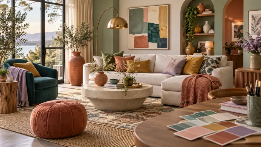
Unique colors can transform a room from ordinary into memorable without requiring major renovations or expensive furniture. Instead of relying only on standard beige, white, gray, or navy, unusual shades can introduce personality, depth, and visual interest. The key is choosing distinctive colors that still work naturally with your existing furniture, lighting, and overall design style.
From dusty teal and burnt terracotta to muted lavender, olive, ochre, and deep aubergine, there are many stylish alternatives to predictable color schemes. Some unusual colors work beautifully as statement walls, while others are better used through furniture, textiles, or decorative accessories. A thoughtful approach keeps the room fresh without making it feel overly trendy or difficult to live with.
Why Unique Colors Can Change the Feel of a Room
Color affects how a room feels almost immediately. Soft, muted shades can create a calm and comfortable atmosphere, while saturated colors make interiors feel more energetic or dramatic. Choosing a less common shade gives the room a stronger sense of identity and helps it stand out from interiors built around conventional neutral palettes.
Unique does not necessarily mean bright or unusual enough to dominate the whole room. A dusty green, warm clay, smoky blue, or mushroom pink can feel distinctive while remaining sophisticated. These shades often have complex undertones that make them more interesting than basic primary colors and easier to combine with natural materials.
The most successful color choices reflect both the room and the person using it. Consider natural light, furniture, flooring, and how you want the space to feel throughout the day. A color that looks exciting in a small sample should still feel comfortable when used across a larger wall or major piece of furniture.
Dusty Teal for a Calm but Distinctive Look
Dusty teal combines blue and green with a softened, slightly gray undertone. It feels richer than pale blue but less intense than bright turquoise, making it suitable for living rooms, bedrooms, kitchens, and home offices. The shade can create a calm atmosphere while still giving the room a clear visual identity.
Pair dusty teal with warm white, beige, tan leather, or natural oak to keep the palette balanced. Brass or brushed gold accents can add warmth and create a more elegant look. For a modern style, charcoal or black details can sharpen the combination without overpowering the softness of the teal.
Dusty teal works especially well when used on cabinetry, accent walls, upholstered chairs, or curtains. If you do not want to commit to paint, introduce the color through cushions, artwork, or a rug. Repeating the shade in two or three places helps it feel intentional rather than accidental.
Terracotta for Warmth and Natural Character
Terracotta is a warm clay-inspired color that sits somewhere between orange, brown, and muted red. It brings an earthy quality into interiors and works beautifully with wood, cream, olive, and sandy neutrals. The color feels warm without having the intensity of bright orange or the heaviness of dark brown.
In living rooms, terracotta walls can create a comfortable and welcoming backdrop. In bedrooms, terracotta bedding or cushions can add warmth without making the room overly dark. The shade also works well in kitchens when used through tiles, pottery, stools, or painted cabinetry.
Terracotta looks especially natural alongside textured materials such as linen, rattan, jute, wood, and stone. These combinations strengthen its earthy character and prevent the color from looking flat. For contrast, add muted blue, sage green, or soft black in smaller amounts.
Muted Lavender for a Soft Modern Style
Muted lavender is a subtle alternative to traditional purple. It contains enough gray to feel calm and sophisticated, making it suitable for adults’ bedrooms, living rooms, offices, and reading corners. Unlike brighter violet shades, muted lavender can behave almost like a neutral when paired carefully with soft surrounding colors.
Warm white, taupe, pale gray, and light wood create an easy background for lavender. For a more interesting combination, pair it with olive green, dusty blue, or muted mustard. These colors provide contrast without making the room look overly colorful or childish.
Lavender can also work through furniture rather than wall paint. A velvet chair, upholstered bench, or set of curtains can introduce the shade in a controlled way. If you enjoy unusual furniture, combining a distinctive tone with a sculptural piece such as a hand chair can create a strong focal point.
Olive Green for a Sophisticated Earthy Palette
Olive green is one of the easiest unique colors to use because it feels natural and understated. It contains warm yellow and brown undertones, giving it a softer appearance than emerald or forest green. The result is a shade that feels grounded, relaxed, and suitable for both traditional and modern interiors.
Olive pairs beautifully with cream, beige, walnut, cognac leather, and brass. These combinations create warmth and depth without requiring many different colors. For stronger contrast, add black, dusty pink, or muted blue in small details such as artwork, cushions, or decorative objects.
Use olive on walls when you want a room to feel intimate and comfortable. It also works well on kitchen cabinets, built-in shelving, sofas, or accent chairs. Because the color is relatively muted, it can cover larger surfaces without becoming as visually demanding as brighter greens.
Ochre Yellow for a Rich, Creative Accent
Ochre is a deep golden yellow with earthy brown undertones. It adds warmth and energy without the sharp brightness of lemon yellow. This makes it a useful choice for people who want to introduce color while keeping the overall interior mature and visually balanced.
Ochre works particularly well with navy, charcoal, deep green, rust, and warm white. It can create a strong contrast against cooler shades while connecting naturally with wood and other warm materials. Even a small amount can make a neutral room feel more interesting and layered.
Consider using ochre through an accent chair, rug, cushions, lampshade, or artwork. If you love bold interiors, an ochre feature wall can become the main visual element. Keep nearby furniture relatively simple so the color feels deliberate rather than competing with several equally strong design elements.
Burnt Orange for a Bold but Balanced Interior
Burnt orange offers the warmth of orange with a deeper, more muted character. It works well in rooms where you want energy without the intensity of bright citrus shades. The color feels especially suitable for autumn-inspired, mid-century, bohemian, and earthy contemporary interiors.
Pair burnt orange with dark green, navy, beige, cream, and warm wood. Black accents can make the palette feel sharper, while brass provides a more luxurious finish. The shade also looks good beside natural textures such as leather, wool, ceramic, and woven fabrics.
A burnt orange sofa can become a dramatic focal point, but smaller applications are easier to update later. Cushions, throws, artwork, or a single upholstered chair can introduce the color without dominating the room. Repeating one related warm tone elsewhere helps create visual consistency.
Deep Aubergine for an Elegant Dramatic Mood
Aubergine is a rich purple shade with red and brown undertones. It feels darker and more sophisticated than conventional purple, making it suitable for dining rooms, bedrooms, lounges, and elegant living spaces. Used correctly, it can add drama without appearing overly theatrical.
Cream, taupe, pale pink, brass, and dark wood work particularly well with aubergine. You can also combine it with olive or muted green for a deeper nature-inspired palette. Keeping at least one lighter neutral nearby prevents the space from becoming too dark or visually heavy.
If full aubergine walls feel too intense, use the shade in velvet upholstery, curtains, cushions, or painted furniture. The richness of the color works especially well with soft fabrics and warm lighting. A small amount can still create a luxurious effect when placed in a visually prominent area.
Clay Pink for a More Grown-Up Pink Palette
Clay pink is softer and earthier than traditional pink. It usually contains beige, brown, or muted red undertones, creating a warm shade that feels sophisticated rather than overly sweet. This makes it useful for living rooms, bedrooms, hallways, or any space where you want subtle warmth.
The color pairs easily with cream, olive, dark brown, charcoal, and natural wood. For a lighter room, combine clay pink walls with white linen and pale oak. For more contrast, use black fixtures, deep green upholstery, or dark wooden furniture.
Clay pink can also replace beige when you want a neutral-like color with more personality. It is warm enough to make a room feel inviting while remaining calm enough for larger surfaces. Layering different textures helps the shade feel richer without adding many additional colors.
Smoky Blue for a Fresh Alternative to Navy
Smoky blue is a muted blue with noticeable gray undertones. It feels calmer than bright blue and lighter than navy, making it ideal for relaxed contemporary interiors. The shade works particularly well in bedrooms, offices, kitchens, and living rooms where you want color without strong visual intensity.
Pair smoky blue with warm white, camel, walnut, beige, or soft gray. Brass and aged gold can introduce warmth, while black creates a more modern edge. Because the shade is relatively balanced, it can support both minimalist and more layered decorating styles.
Smoky blue is also versatile enough for cabinetry, walls, upholstery, and textiles. In a small room, use it on one feature area and keep surrounding surfaces lighter. In larger spaces, the color can cover multiple walls without feeling overwhelming when sufficient natural light is available.
Deep Mushroom for an Unusual Neutral
Mushroom is a complex neutral that can sit between beige, taupe, gray, and brown. It is more distinctive than standard beige but still easy to live with. Because the shade changes slightly depending on lighting, it can give a room depth without relying on strong contrast.
Deep mushroom works well with cream, black, olive, rust, and dark wood. It can support colorful furniture while remaining calm enough to use on walls. This makes it particularly useful for people who want something more original than gray but do not want a bold color scheme.
Test mushroom colors carefully because some versions lean pink, green, or purple. Lighting can make those undertones more noticeable at different times of day. Large paint samples are especially useful for seeing whether the shade coordinates with existing floors, cabinets, and furniture.
How to Combine Unique Colors Without Making a Room Busy
Start with one unusual color rather than several competing statement shades. Let that color become the main feature, then support it with quieter neutrals and natural materials. A dusty teal sofa, for example, can look stronger when surrounded by cream, wood, and black than when placed beside several equally bright colors.
Use repeated accents to create consistency. If your main color appears on a chair, repeat a smaller version through artwork, cushions, or decorative objects. The repetition helps the eye understand that the color is part of a deliberate scheme rather than an isolated piece that does not belong.
Texture is another useful tool. Two items in similar colors can look very different when one is velvet and the other is linen, wood, or ceramic. Mixing materials allows you to keep the color palette controlled while still creating enough variation to make the room feel layered and interesting.
How Lighting Changes Unique Colors
Natural light can make unusual shades look dramatically different throughout the day. Morning light may emphasize cool undertones, while warmer evening light can bring out yellow, red, or brown tones. This is why choosing paint from a small store sample can sometimes lead to surprising results at home.
Artificial lighting matters too. Warm bulbs can soften blues and greens while making terracotta or ochre appear richer. Cooler bulbs may make gray or blue shades feel sharper but can reduce the warmth of earthy colors. Consider both daytime and nighttime appearance before making a final decision.
Always test paint or fabric in the actual room. Move samples around different walls and observe them over several hours. This simple step can prevent costly mistakes and helps ensure your chosen unique color remains attractive in the real lighting conditions of your home.
Tips for Choosing a Unique Color You Will Still Love Later
Choose a color based on the feeling you want rather than simply following trends. If you naturally prefer calm interiors, dusty teal or olive may remain appealing longer than neon colors. If you enjoy dramatic spaces, aubergine or burnt orange may better reflect your personal style.
Consider where the color will appear and how difficult it would be to change later. Bold paint is relatively easy to update, while an expensive sofa or custom cabinetry requires a longer commitment. Use highly distinctive colors on flexible elements if you frequently change your decorating style.
Finally, look at the colors already present in your home. Flooring, countertops, furniture, and wood finishes all influence how a new shade will behave. The best unique color is one that feels fresh while still connecting naturally with the permanent elements around it.
Conclusion
Unique colors can give your home personality without making it feel overwhelming. Dusty teal, terracotta, muted lavender, olive, ochre, burnt orange, aubergine, clay pink, smoky blue, and mushroom all offer stylish alternatives to predictable neutral palettes. Each shade creates a different mood and works with different materials.
The key is balance. Choose one dominant color, support it with neutrals, and repeat related tones through smaller accessories. Natural materials, textured fabrics, and thoughtful lighting can help even unusual shades feel comfortable and well integrated.
Before committing, test colors in the actual room and observe how they change throughout the day. Focus on shades you genuinely enjoy rather than those that are simply popular. A distinctive color chosen carefully can make an interior feel fresher, more personal, and far more memorable.
FAQs
What are some unique colors for home interiors?
Dusty teal, olive, terracotta, clay pink, ochre, muted lavender, smoky blue, aubergine, and mushroom are distinctive options that can add personality without feeling excessively bright or difficult to decorate around.
What unique colors work well with neutral furniture?
Olive, smoky blue, burnt orange, dusty teal, and muted lavender pair well with beige, white, gray, and cream furniture. Neutral surroundings allow unusual colors to stand out without making the room feel busy.
How many bold colors should I use in one room?
One main bold or unusual color is usually enough. You can add one supporting accent color and use neutrals throughout the rest of the space to keep the overall design balanced.
Which unique colors make a room feel warm?
Terracotta, burnt orange, ochre, clay pink, and warm olive can make interiors feel warmer and more inviting. They work especially well with wood, cream, beige, brass, and natural textures.
What is the safest way to try an unusual color?
Start with smaller items such as cushions, artwork, rugs, or an accent chair. If you like the effect, you can gradually introduce the shade through larger furniture pieces or painted walls.