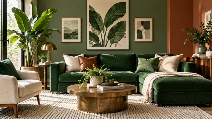
Green is one of the most versatile colors in interior design because it can feel fresh, calming, natural, dramatic, or sophisticated depending on the shade. From soft sage and muted olive to deep emerald and forest green, each variation creates a different mood and works with a wide range of complementary colors.
Choosing colors that go with green depends on undertones, room size, lighting, and the atmosphere you want to create. Neutral shades can make green feel relaxed, while warm colors add energy and richer tones create contrast. Understanding a few basic color combinations makes decorating with green much easier.
Why Green Is So Easy to Decorate With
Green appears throughout nature, so it naturally works with many colors we already see together outdoors. Think of green leaves against brown wood, blue skies, white flowers, or colorful blossoms. These combinations feel familiar, which is one reason green can work comfortably in living rooms, kitchens, bedrooms, bathrooms, and offices.
Different green shades also offer remarkable flexibility. Sage green feels soft and understated, olive green has an earthy warmth, emerald green looks luxurious, and forest green creates depth and drama. Selecting the right companion colors starts with understanding whether your chosen green appears warm, cool, muted, bright, light, or dark.
Lighting also changes how green appears inside a room. Natural daylight may highlight blue or yellow undertones that are less noticeable under artificial lighting. Before committing to a large surface, test paint, fabrics, or finishes in the actual space during different times of day to see how the complete color combination feels.
Green and White for a Fresh, Clean Look
White is one of the easiest colors to pair with green because it creates a clean and balanced contrast. Bright white can make emerald, forest, or bottle green appear crisp and dramatic. Softer whites work beautifully with sage and olive when you want the room to feel calm rather than highly contrasted.
In a green living room, white ceilings, trim, curtains, and furniture can keep the space from becoming visually heavy. The lighter surfaces reflect more light while allowing the green to remain the main feature. This combination works particularly well in smaller rooms where dark green walls might otherwise make the space feel enclosed.
Pay attention to the undertone of the white you choose. Cool whites often complement blue-based greens, while creamier whites tend to work naturally with warmer olive or moss shades. Testing the two colors side by side helps prevent a warm green from making a very cool white appear unexpectedly harsh.
Green and Beige for a Calm Natural Palette
Beige and green create a warm, nature-inspired combination that works especially well in relaxed interiors. Soft beige tones reduce the intensity of stronger greens while adding warmth to pale green rooms. The result can feel comfortable, timeless, and easy to decorate without appearing too plain or overly coordinated.
Sage green and beige are particularly effective together in bedrooms and living spaces. Beige upholstery, woven rugs, linen curtains, and natural textiles provide a neutral foundation while green introduces gentle color. This combination also gives you flexibility to add wood, black, cream, or brass accents without creating an overly complicated palette.
Choose the beige carefully because some shades lean yellow, pink, or gray. Warm beige usually looks harmonious with olive and moss green, while taupe-based neutrals can complement cooler sage tones. Using several textures within the neutral color family can add visual depth even when the overall palette remains understated.
Green and Brown for an Earthy Interior
Brown is a natural partner for green because the combination immediately brings to mind plants, trees, soil, and wood. Rich walnut furniture can look elegant against emerald or forest green walls, while lighter oak creates a relaxed effect with sage or muted green. The pairing feels grounded without needing many additional colors.
Leather furniture is another effective way to introduce brown into a green room. Cognac leather creates a particularly attractive contrast with deep green because both colors feel rich without competing for attention. Brown wooden floors, shelving, picture frames, or side tables can provide the same warmth on a smaller scale.
For a modern look, avoid using too many matching brown finishes. Mixing light and medium woods often feels more natural than choosing identical furniture throughout the space. Add cream, white, or black accents to break up the earthy tones and prevent a green-and-brown room from feeling visually heavy.
Green and Pink for a Soft Yet Stylish Contrast
Green and pink sit in an interesting relationship because their contrasting qualities can make both colors appear more vibrant. Dusty pink and sage green create a subtle, romantic combination, while emerald green and richer pink shades produce a bolder, more luxurious effect. The amount of each color determines whether the space feels playful or sophisticated.
If you want a restrained look, use green as the dominant color and introduce pink through cushions, artwork, flowers, or a small chair. This gives the room personality without making the combination overwhelming. Alternatively, pale pink walls can form a soft background for darker green furniture or cabinetry.
The key is choosing tones with similar intensity. Muted pink usually looks better with muted green, while saturated pink can stand up to deep emerald. Adding neutral colors such as cream, warm white, beige, or natural wood between them can create breathing room and make the overall scheme feel more polished.
Green and Blue for a Cool, Relaxing Scheme
Blue and green often appear together in nature, making them an easy combination for calm and comfortable interiors. Navy blue adds depth next to emerald or forest green, while pale blue can soften stronger greens. Teal, turquoise, and muted blue-green shades can create more layered tonal schemes with relatively little contrast.
This pairing works particularly well in bedrooms, bathrooms, and living spaces where a relaxed atmosphere is desirable. You might combine sage walls with blue bedding or place a navy sofa against a muted green wall. Keeping one color dominant helps prevent the space from looking overly busy.
Warm accents can balance a cool blue-and-green palette. Natural wood, tan leather, brass, or cream textiles can stop the room from feeling cold. If the space receives limited natural light, choosing softer or warmer versions of blue and green can also help maintain an inviting atmosphere.
Green and Yellow for a Cheerful Look
Yellow adds warmth and energy to green, creating a combination that can feel bright and optimistic. Mustard yellow works particularly well with olive, forest, and dark green because its warmth balances the cooler qualities of green. Softer buttery yellow can pair beautifully with pale sage for a lighter appearance.
You do not need large amounts of yellow for the combination to work. A mustard chair, cushions, artwork, or decorative objects can introduce enough warmth into a predominantly green room. When both colors are very bright, however, the effect becomes much more energetic and may be better suited to smaller accents.
For seasonal decorating, orange and yellow can also complement green beautifully because they reflect natural autumn colors. Decorative greenery can sit beside warm seasonal accessories, while creative pumpkin ideas can add character during fall. Keeping larger surfaces neutral prevents seasonal colors from overwhelming the permanent interior scheme.
Green and Black for a Modern, Dramatic Style
Black gives green a sharper and more contemporary appearance. Matte black hardware, lighting, furniture frames, or window details can create clean definition against sage, olive, or emerald green. The combination works particularly well in kitchens and bathrooms where metal fixtures provide easy opportunities to introduce darker contrast.
Dark green and black together can create a sophisticated mood, but they require enough light to avoid making the room feel excessively heavy. Use white ceilings, pale flooring, mirrors, or lighter furniture to break up large dark areas. Natural light can also make rich green tones appear more dimensional.
If you prefer a softer look, use black only as a small accent. Thin black picture frames, lamp bases, cabinet handles, and occasional tables provide structure without dominating the palette. This technique is especially effective in neutral rooms where green is already being used through upholstery, plants, or painted cabinetry.
Green and Gray for a Balanced Contemporary Palette
Gray can make green feel modern and understated, especially when both colors have muted undertones. Light gray works well with deep green by creating contrast without the sharpness of pure white. Dark charcoal, meanwhile, can give pale sage a stronger and more architectural appearance.
Sage green and warm gray are popular together because both colors have a soft, relaxed quality. The pairing suits minimalist bedrooms, offices, bathrooms, and contemporary living rooms. Textured fabrics, natural wood, and warm lighting can prevent a gray-and-green room from looking flat or overly cool.
Consider the undertones carefully when selecting gray. Blue-gray can emphasize cooler qualities in green, while greige creates warmth and often works better with olive or yellow-based greens. Paint samples are particularly valuable because gray can shift noticeably depending on daylight, nearby furniture, and the surrounding wall colors.
Green and Gold for an Elegant Finish
Gold and brass accents can make green feel more luxurious without requiring major decorating changes. Deep emerald looks especially striking with warm metallic finishes because the combination has richness and contrast. Brass lighting, handles, mirrors, and decorative objects are simple ways to introduce this effect throughout a room.
You can use the same idea with softer greens as well. Sage cabinetry with brushed brass hardware creates a warm and refined kitchen look, while olive walls can provide an attractive background for antique gold frames. The metal does not need to be highly polished; aged brass often produces a more relaxed and timeless finish.
Avoid adding too many shiny surfaces at once. A few carefully placed metallic accents usually look more sophisticated than using gold on every available detail. Combine the metallic finish with natural materials such as wood, linen, stone, or wool to make the room feel layered rather than overly glamorous.
How to Choose the Right Shade of Green
Begin by deciding what mood you want the room to create. Sage, eucalyptus, and pale green tend to feel calming and airy, while olive and moss create warmth. Emerald, bottle green, and forest green produce stronger drama and can make large rooms feel more intimate and visually interesting.
Next, consider existing fixed elements such as flooring, countertops, tiles, cabinetry, or large furniture. A green shade should relate comfortably to these features because replacing them may not be practical. Warm wood floors, for example, often suit olive and sage, while cooler stone finishes can work beautifully with blue-based greens.
Always test several green samples before making a final decision. Paint a large sample or move fabric swatches around the room to observe them in morning, afternoon, and evening light. A shade that appears perfectly balanced in a store can look dramatically warmer, darker, or cooler once placed inside your home.
How to Build a Balanced Green Color Scheme
A simple approach is to choose one dominant green, one supporting neutral, and one smaller accent color. For example, sage green walls could be paired with beige furniture and black accents. This creates enough variation to feel interesting while preventing the room from becoming visually confusing.
You can also use several shades of green within the same space. Pale green walls, darker green cushions, and natural plants create a layered monochromatic effect. Adding different textures through velvet, linen, wood, ceramic, and woven materials helps distinguish similar colors and prevents the design from appearing flat.
Try not to divide every color equally throughout the room. A strong palette often looks better when one shade clearly dominates while other colors support it in smaller amounts. Rugs, artwork, curtains, cushions, and accessories make it easy to adjust the balance without committing to expensive furniture or major renovations.
Conclusion
Green works with an impressive range of colors because it can behave almost like a natural neutral in many interiors. White, beige, brown, blue, pink, gray, yellow, black, and gold can all complement green when the undertones and intensity levels are chosen carefully. The best combination depends on the mood you want to create.
For calm interiors, combine sage or muted green with beige, cream, pale gray, or soft blue. If you prefer something more dramatic, emerald or forest green can work beautifully with black, navy, gold, or warm pink. Natural wood remains one of the easiest additions because it complements almost every variation of green.
Before decorating an entire room, test your colors together under the actual lighting conditions. Consider flooring, furniture, textiles, and permanent finishes as part of the complete palette. With thoughtful balance and a clear dominant color, green can create interiors that feel fresh, comfortable, stylish, and visually connected.
FAQs
What color goes best with green?
White, beige, brown, blue, pink, gray, black, and gold all work well with green. The best choice depends on whether your green shade is warm, cool, light, dark, muted, or highly saturated.
What neutral colors go with green?
White, cream, beige, taupe, greige, and gray are excellent neutral partners for green. Warm neutrals usually complement olive and moss, while cooler neutrals can work well with sage or blue-based green.
Does blue go with green?
Yes. Blue and green create a natural, calming combination commonly seen outdoors. Navy works beautifully with deeper greens, while pale blue can pair with sage or muted green for a softer effect.
What colors go with sage green?
Sage green works well with warm white, beige, taupe, dusty pink, soft blue, brown, black, and brass. Natural wood tones are also particularly effective in sage-green interiors.
What color makes dark green stand out?
White, cream, blush pink, gold, and lighter neutral shades create strong contrast with dark green. Black and navy can also look sophisticated when the room has enough light to support a darker palette.