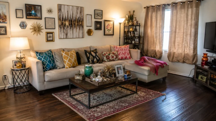
Home Decor Mistakes That Make Your Space Look Cheap
A space can look cheap even when the furniture was expensive, and that is what makes home decorating feel confusing for many people. The problem is usually not one bad item. It is a collection of small decorating mistakes that weaken the whole room. Poor lighting, short curtains, undersized rugs, cluttered surfaces, and mismatched finishes can quietly pull attention away from the good choices you made. Once you understand these details, your home becomes much easier to improve.
Cheap-looking home decor does not mean your home lacks value, taste, or personality. It simply means something in the room is making the design feel unfinished, flat, or disconnected. Most of these mistakes happen because people decorate in pieces instead of thinking about the room as a full composition. A lamp is bought on sale, a rug is chosen by guesswork, curtains are hung quickly, and accessories slowly multiply. The result can feel busy without feeling intentional.
The fresh approach to interior styling is more personal, layered, and practical than the old idea of perfect showroom decor. Today, rooms look elevated when they feel lived in, but still edited. Natural textures, better lighting, larger-scale pieces, warm color palettes, and meaningful objects are more important than filling a house with matching furniture. A stylish home should support real life while still feeling calm, balanced, and thoughtfully finished.
This article focuses on the most common home decor mistakes that make your space look cheap and shows you how to fix them in a realistic way. You do not need to replace everything or follow expensive design rules. In many cases, the solution is to move furniture, resize a rug, add lamps, edit surfaces, upgrade hardware, or choose better textures. Small corrections can make a room look more polished almost immediately.
Think of this as a friendly design audit, not a list of things to feel bad about. Every home has a few awkward corners, outdated items, or rushed decisions. The goal is to notice what is lowering the look of the room and replace it with choices that feel more cohesive. When lighting, scale, texture, color, and layout begin working together, your space looks more expensive, more comfortable, and more like you.
Mistake 1: Choosing Rugs That Are Too Small
An undersized rug is one of the fastest ways to make a room look cheap because it breaks the visual connection between furniture pieces. When a rug floats in the middle of the floor with only the coffee table on it, the seating area can feel scattered. The room may even look smaller because the furniture does not feel anchored. A rug should help define the conversation zone, not look like a small mat placed after everything else.
In a living room, a better rug usually allows at least the front legs of the sofa and chairs to sit on it. In a bedroom, the rug should extend beyond the bed enough for your feet to land on softness when you get up. In a dining room, the rug should be large enough for chairs to stay on it when pulled out. These simple sizing rules make a room feel grounded, calm, and more professionally arranged.
The mistake often happens because larger rugs cost more, so people choose the smaller size and hope it works. Unfortunately, the wrong size can make even beautiful furniture look awkward. If a large rug is outside your budget, consider layering a smaller patterned rug over a larger natural fiber rug. This gives you scale, texture, and character without the cost of one oversized designer piece. The layered look can also make a room feel warmer and more collected.
Rug placement matters as much as rug size. A rug should follow the main furniture grouping instead of being centered only with the room or the ceiling light. If your sofa, chairs, and table form one zone, the rug should support that zone. In open-plan spaces, rugs can help separate living, dining, and reading areas. This makes the layout feel intentional rather than random, which is a key part of expensive-looking home decor.
If your room already has a small rug, try repositioning it before buying a replacement. Sometimes turning it the other way, layering it, or moving furniture closer can improve the look. If it still feels disconnected, plan for a larger rug as a high-impact upgrade. A correctly sized rug changes the entire room because it adds structure, comfort, and visual balance. It is one of the smartest fixes for cheap-looking decor.
Mistake 2: Relying on Harsh Overhead Lighting
Lighting can make or break a room, and harsh overhead lighting is one of the most common interior design mistakes. A single ceiling light can flatten textures, create shadows in the wrong places, and make the room feel cold. Even an expensive sofa, artwork, or paint color may look less appealing under harsh light. When a space has only one light source, it often feels unfinished because there is no depth or atmosphere.
A more elevated room uses layered lighting from different heights. This means combining overhead lighting with table lamps, floor lamps, wall sconces, picture lights, under-cabinet lights, or small accent lamps. Each layer has a job. Some lights help you see clearly, some create warmth, and some highlight the best parts of the room. Layered lighting makes a home feel thoughtful because it can shift from daytime function to evening comfort.
Bulb temperature also affects whether a room looks cheap or refined. Very cool white bulbs can make interiors feel clinical, especially in bedrooms, living rooms, and dining areas. Warmer bulbs create a softer glow that flatters wood, fabric, paint, and skin tones. In work areas, kitchens, or bathrooms, you may still need brighter task lighting. The key is control, so the room is not stuck in one harsh setting all day and night.
Outdated fixtures can also lower the look of a space. Builder-grade flush mounts, flimsy pendants, and overly shiny finishes can make the room feel less current. Replacing one central light with a sculptural fixture, pleated shade, simple chandelier, or clean-lined pendant can create a focal point quickly. You do not need the most expensive option. You need a fixture with good proportion, a finish that connects to the room, and light that feels pleasant.
Dimmers are another small detail that can make a home look more high-end. They allow you to lower brightness in the evening and create a more relaxed atmosphere. If hardwiring is not possible, use plug-in lamps, battery sconces, or smart bulbs to gain more control. A room with gentle pools of light feels more layered and inviting. Poor lighting cheapens a room, but better lighting can make the same furniture look completely different.
Mistake 3: Hanging Curtains Too Low or Too Short
Curtains have a bigger effect on a room than many people realize. When curtains are too short, too narrow, or hung directly on the window frame, the whole space can look unfinished. Short curtains visually cut the wall and make ceilings feel lower. Thin panels can look limp and temporary. Even beautiful fabric loses impact when the scale is wrong, which is why curtain mistakes often make a room look cheaper than it is.
The easiest fix is to hang curtain rods higher and wider. Placing the rod closer to the ceiling helps the room feel taller, while extending it beyond the window lets more light in when the curtains are open. This creates the impression of larger windows and a more custom design. Curtains should usually kiss the floor or hover just above it. That clean length makes the wall feel longer and the window treatment more intentional.
Fullness is another detail that separates polished window treatments from cheap-looking ones. Panels should have enough fabric to look generous when closed, not stretched flat across the window. If you are using budget curtains, buying extra panels can make them appear more expensive. Lined curtains often hang better because the fabric has more weight and structure. The result is softness, movement, and texture instead of a thin afterthought.
Material choice matters too. Natural-looking fabrics like linen, cotton, wool blends, and heavier textured weaves tend to look more elevated than shiny synthetic panels. This does not mean every curtain has to be custom or costly. It means the fabric should have body and suit the room. Simple neutral panels can look luxurious when they are hung well, sized correctly, and paired with hardware that feels sturdy and considered.
Curtain hardware should not be ignored. A flimsy rod, plastic rings, or mismatched brackets can quietly cheapen the window treatment. Choose a rod finish that connects with your lighting, door handles, or cabinet hardware. Black, aged brass, warm wood, bronze, and polished nickel can all work when used consistently. Good curtains frame a room like architecture. When they are treated as a design feature, the entire space feels more finished.
Mistake 4: Buying Matching Furniture Sets
Matching furniture sets can make a room feel flat because everything has the same finish, style, and personality. While matching pieces may feel safe in the store, they often look like a showroom at home. A bedroom set with the same bed, nightstands, dresser, and mirror can remove the collected feeling that makes interiors interesting. A living room with matching tables and identical finishes can feel predictable rather than warm and layered.
Designer-looking rooms usually mix pieces that relate without being identical. A wood bed can pair with painted nightstands, a modern sofa can sit beside a vintage side table, and a sleek dining table can work with textured chairs. The pieces should share a sense of balance, but they do not need to come from one collection. This creates depth and makes the room feel built over time instead of purchased in one afternoon.
The fix is not to replace everything at once. Start by breaking up the most obvious matching set. Swap one nightstand, change the mirror, paint a dresser, replace table lamps, or add a different texture through a bench or chair. If your living room tables all match, consider changing one side table for metal, stone, glass, or painted wood. Small contrasts can make the entire room feel more curated.
Too much matching also happens with finishes. If every item is black, chrome, white, or the same wood tone, the room can feel one-dimensional. A better approach is to repeat finishes in a softer way. Use one main wood tone, one metal finish, and one or two supporting textures. This keeps the room cohesive without making it look copied. Cohesion feels expensive, but exact matching can feel stiff.
Slow decorating helps prevent this mistake. Instead of filling a room quickly, live with the space and notice what it needs. Look for pieces with different shapes, materials, or histories. Mix new items with vintage finds, handmade objects, or meaningful decor. A home looks more elevated when it has layers and personality. Matching furniture may be easy, but a collected room usually feels more expensive.
Mistake 5: Using Too Many Small Accessories
Small accessories can make a room feel personal, but too many of them can make it look cluttered and cheap. Tiny candles, small vases, little frames, souvenirs, figurines, and random trays often compete for attention. When every surface is filled, the eye has nowhere to rest. Even nice objects lose value when they are crowded together. The room begins to feel busy instead of styled.
A more polished approach is to use fewer, larger pieces with stronger presence. Instead of ten small items on a console, try a lamp, a stack of books, a bowl, and one vase with branches. On a coffee table, use a tray to group smaller pieces so they feel intentional. On shelves, mix books, art, boxes, ceramics, and empty space. Negative space is not wasted. It is what allows good decor to breathe.
Scale matters when choosing accessories. A tiny piece of art above a sofa can look lost, while a large framed print or grouped gallery wall can feel more complete. A small vase on a big dining table may look accidental, but a taller arrangement or sculptural bowl can anchor the surface. Bigger does not always mean more expensive. It simply means the object has enough visual weight for the place where it sits.
Clutter often comes from keeping everything visible because each item has a memory or purpose. A people-first home does not need to hide personality, but it does need editing. Rotate sentimental items instead of displaying all of them at once. Store seasonal decor away when it is not relevant. Keep remote controls, chargers, keys, papers, and daily items in baskets, drawers, or trays. This keeps the room functional without looking chaotic.
The best styled rooms feel personal but controlled. They include books someone reads, art someone loves, objects with meaning, and textures that invite touch. What they avoid is the feeling of a store shelf filled with filler pieces. If your space feels cheap, remove half the accessories and study what remains. Often, the room looks better with less because the strongest pieces finally get attention.
Mistake 6: Ignoring Scale and Furniture Layout
Poor scale can make a room look cheap even when the individual pieces are attractive. A sofa that is too large can overpower a small room, while tiny chairs can look lost in a large living area. A coffee table that sits too far from the seating feels awkward, and a TV mounted too high can throw off the whole wall. Interior design mistakes often come down to size, spacing, and how people actually move through the room.
Many people push all furniture against the walls because they think it creates more space. In some rooms, this works, but often it leaves an empty center and makes the seating feel disconnected. Floating a sofa slightly, pulling chairs closer, or adding a rug that anchors the group can create a more conversational layout. The room begins to feel designed rather than arranged around the edges. That shift can instantly make it look more expensive.
Furniture should support the way the room is used. If people gather to talk, the seating should face inward enough for conversation. If the room is for watching TV, the screen should be comfortable to view without dominating every wall. If the space is for reading, a chair needs a lamp and a table nearby. A room looks cheap when it ignores function, because awkward living always shows through the decor.
Measure before buying new pieces, especially rugs, sofas, dining tables, beds, and media consoles. Guessing can lead to furniture that looks either cramped or undersized. Use painter’s tape on the floor to test dimensions before ordering. Check walking paths, door swings, and clearance around chairs. These practical steps may not feel glamorous, but they prevent costly mistakes. A well-scaled room looks calmer and more custom.
If your furniture layout feels wrong, rearrange before you shop. Move seating closer, adjust the rug, lower artwork, shift side tables, or try lamps in different corners. Sometimes the room already has what it needs, but the pieces are not working together. Good layout creates flow, comfort, and visual balance. When scale is right, even budget furniture can look polished and intentional.
Mistake 7: Choosing Cheap-Looking Materials and Finishes
Some materials make a space look cheap because they try too hard to imitate luxury. Very shiny faux marble, thin plastic finishes, flimsy metallic accents, fake distressed wood, and lightweight synthetic fabrics can look artificial. The issue is not always price. It is whether the material has enough depth, texture, and honesty. Simple materials often look better than imitation finishes that are pretending to be something expensive.
Natural textures are usually safer because they age and catch light in a more interesting way. Wood, linen, cotton, wool, stone, ceramic, glass, rattan, and metal can all elevate a room when used with balance. You do not need the most expensive version of each material. A ceramic lamp, wood tray, woven basket, cotton curtain, or stone-look object with a matte finish can bring warmth without looking forced.
Hardware is another area where quality shows quickly. Cabinet pulls, faucets, doorknobs, towel bars, curtain rods, and light switches are touched often, so cheap finishes can peel, chip, rust, or loosen. If you cannot upgrade everything, start with the most visible or most-used pieces. A better faucet in a bathroom, sturdier kitchen cabinet handles, or updated door hardware can make the room feel cared for. Small finishes can change the whole impression.
Overly shiny surfaces can also cheapen a room, especially when every finish reflects light in the same way. A better space mixes matte, satin, textured, and reflective surfaces. Pair a smooth table with woven chairs, a glossy vase with linen curtains, or a metal lamp with a wood side table. This contrast creates depth. Luxury home decor often feels rich because surfaces behave differently under light.
When choosing budget decor, look for pieces with weight, texture, and simple shapes. Avoid items that look flimsy, overly ornate, or too trend-specific. A plain ceramic bowl can look more expensive than a shiny plastic tray with fake gold detailing. A solid wood secondhand table can look better than a lightweight new piece with a printed wood finish. Honest, well-chosen materials almost always beat imitation luxury.
Mistake 8: Letting Trendy Choices Take Over
Trends can make a home feel fresh, but too many trendy choices can make it look cheap or dated quickly. A bold tile, viral sofa shape, loud wallpaper, unusual paint color, and statement lighting fixture may each look exciting alone. Together, they can feel overwhelming. The room starts to look like a collection of internet moments instead of a home with a clear point of view. Trend overload is one of the easiest ways to lose elegance.
Permanent finishes deserve the most caution. Tile, flooring, countertops, built-ins, and bathroom fixtures are harder and more expensive to change than cushions or artwork. If a finish is extremely bold, ask whether you will still love it in five years. Classic shapes, natural materials, and calmer colors usually age better in expensive areas. You can still add personality through paint, rugs, lamps, art, and accessories that are easier to update later.
This does not mean your home should be plain. A room without personality can feel just as lifeless as one with too many trends. The better approach is to choose one or two statement moments and let the rest of the room support them. A colorful sofa can work with simple curtains and grounded lighting. A patterned bathroom floor can look elegant with quiet walls. A dramatic wall color can feel refined with natural textures and restrained styling.
Trend fatigue often happens when people decorate too quickly. Buying every popular item at once can make a room feel dated as soon as the trend shifts. Slow decorating gives you time to notice what actually fits your home and lifestyle. It also allows you to invest in pieces with staying power. When a trend supports your personal taste, it becomes style. When it only follows the moment, it can make the room feel less authentic.
Use trends as accents, not instructions. Warm neutrals, layered lighting, curves, vintage pieces, natural materials, and expressive patterns can all look beautiful when edited well. The key is balance. Let your home have a few current details, but keep the foundation strong. A space looks more expensive when it feels personal and settled, not as if it is trying to prove it knows every new trend.
Mistake 9: Forgetting Walls, Paint, and Architectural Details
Walls make up a huge part of every room, so ignoring them can make a space look unfinished. Scuffed paint, outdated colors, blank walls, awkward art placement, and neglected trim can cheapen the overall look. Even if your furniture is strong, tired walls can make the room feel neglected. Paint, art, molding, mirrors, and wall texture are not extras. They are part of the structure that holds the whole design together.
Choosing paint without testing it is another common home styling mistake. A color can look different depending on natural light, bulb temperature, flooring, and furniture. What appears soft in one room can look dull, yellow, blue, or too dark in another. Test samples on several walls and watch them through the day. The right paint color can make a room feel fresh and expensive, while the wrong one can make everything else harder to style.
Artwork should match the scale of the wall and furniture around it. A tiny frame above a large sofa often looks accidental, while oversized art or a balanced gallery wall feels more deliberate. Hang art at a comfortable eye level and connect it visually to nearby furniture. Mirrors should reflect something attractive, such as light, greenery, artwork, or an open view. Random wall decor can feel cheap, but thoughtful placement makes the room feel considered.
Architectural details can also lift a plain room. Picture molding, taller baseboards, wall paneling, painted trim, upgraded doors, or a more substantial mantel can add character. You do not need heavy or ornate details. Even simple trim can make a new-build room feel more custom. These upgrades work because they make the room feel designed before furniture enters it. A decorated box looks less refined than a room with depth and structure.
Maintenance is part of wall decor too. Touch up chips, clean baseboards, repair holes, and remove old hooks or marks. A home can have beautiful furniture and still look cheap if the walls feel ignored. Fresh paint, clean trim, properly scaled art, and a few architectural details create a polished backdrop. Once the background improves, your existing decor often looks better without changing much else.
Mistake 10: Overlooking Kitchens, Bathrooms, and Entryways
Kitchens, bathrooms, and entryways often shape a guest’s first impression, so neglecting them can make the whole home feel less polished. These spaces contain many functional items, which means clutter, cheap fixtures, and dated finishes show quickly. A beautiful living room may not carry the house if the entryway feels messy or the bathroom feels poorly maintained. Luxury is most convincing when the practical spaces also feel considered.
In the kitchen, visible clutter is a major issue. Too many appliances, mismatched containers, dish soap bottles, paper towels, magnets, and random decor can make counters feel chaotic. Keep out only what is useful or beautiful. A wood cutting board, ceramic bowl, simple soap dispenser, small lamp, or vase can soften the room without crowding it. Clearer counters make even modest kitchens look more expensive because the surfaces have room to breathe.
Bathrooms can look cheap when they rely on loud, dated, or low-quality fixtures. A busy tile pattern, overly ornate vanity, rusty faucet, plastic accessories, or harsh light can make the room feel less calm. Choose cleaner lines, better lighting, simple storage, and coordinated finishes where possible. Plush towels, a framed mirror, a tray, and hidden product storage can create a spa-like feeling without a full remodel.
Entryways often collect shoes, bags, keys, mail, and coats, so they need systems as much as style. A slim console, hooks, baskets, a mirror, a runner, and a warm lamp can make the space feel welcoming instead of chaotic. Even a small entry can look elevated when everything has a place. Because this area is seen first, small improvements here can make the entire home feel more put together.
Laundry rooms, hallways, and landings deserve attention too. A small lamp, fresh paint, framed art, clean hardware, or a tidy storage solution can make these overlooked areas feel finished. Cheap-looking decor often happens when only the main rooms receive care. A home looks more expensive when the design language continues from one space to the next. Consistency turns ordinary areas into part of the overall style.
How to Fix Cheap-Looking Decor Without Overspending
The best way to fix cheap-looking decor is to start with the highest-impact changes, not the most expensive ones. Improve lighting, correct rug size, hang curtains properly, edit clutter, and repair visible wear before buying new furniture. These changes affect how the whole room feels. A better lamp, larger rug, fresh paint touch-up, or full-length curtain panel can make existing pieces look more intentional.
Create a simple plan before shopping. Decide your color palette, preferred materials, main furniture layout, and the mood you want each room to have. Without a plan, it is easy to buy random items that look nice alone but do not work together. A plan helps you avoid impulse purchases and choose pieces that support the full room. This is how budget home decor starts looking elevated instead of accidental.
Shop slowly and mix sources. Vintage shops, secondhand marketplaces, local artisans, budget retailers, and higher-end stores can all work together when the room has a clear direction. Spend more on items that affect comfort and scale, such as sofas, rugs, mattresses, and lighting. Save on smaller accessories that can be changed later. Mixing high and low pieces thoughtfully often looks better than buying everything from one place.
Use styling to make affordable pieces look better. Place books under small objects to add height, use trays to group daily items, layer pillows with fuller inserts, and add branches or greenery for life. Replace cheap lampshades, update hardware, hide cords, and remove packaging from visible products. These small details create polish. They also show that the room has been cared for, which matters more than the price of each item.
Most importantly, edit before adding. Take photos of the room and notice what feels crowded, undersized, harsh, or disconnected. Remove weak pieces, rearrange furniture, and give the room a little space. Then add only what solves a real problem. A home looks expensive when choices feel deliberate. With patience and smart fixes, you can make your space look more refined without overspending or losing personality.
Final Thoughts on Avoiding Home Decor Mistakes
Home decor mistakes are normal because decorating is a process, not a one-time decision. Most people learn what works by living with a room, noticing what feels off, and making small changes over time. The good news is that cheap-looking decor usually has practical causes. Lighting can be layered, rugs can be resized, curtains can be rehung, clutter can be edited, and finishes can be upgraded gradually.
The biggest shift is learning to see the room as a whole. Instead of asking whether one item is beautiful, ask whether it supports the room’s scale, mood, function, and color palette. A piece that looks great in a store may not be right for your space, while a simple secondhand item may be perfect. Good decorating is not about price alone. It is about relationship, balance, and intention.
Fresh interior design today is moving toward homes that feel layered, comfortable, and personal. That means your home does not need to look sterile or overly perfect to look expensive. It can have books, family photos, vintage pieces, color, pattern, and signs of real life. The difference is editing. When personal items are arranged with care, they add character. When they are scattered everywhere, they become visual noise.
Start with one room and one mistake. Fix the lighting in the living room, rehang the bedroom curtains, clear the kitchen counters, or choose a better rug for the seating area. Small wins build confidence and make the next decision easier. As each room becomes more balanced, the whole home begins to feel more cohesive. This slower approach usually leads to better results than rushing to replace everything.
Your space does not need to be perfect to feel polished. It needs enough structure to feel calm, enough texture to feel warm, and enough personality to feel like home. Avoiding common home decor mistakes helps your best choices stand out. When you decorate with scale, lighting, function, and restraint in mind, your home looks less cheap, more elegant, and much more enjoyable to live in.
What is the biggest home decor mistake that makes a room look cheap?
One of the biggest mistakes is poor scale, especially rugs that are too small, curtains that are too short, and furniture that does not fit the room. Correct sizing makes a space look more balanced and expensive.
How can I make my home look expensive without buying new furniture?
Improve lighting, rehang curtains higher, edit clutter, update hardware, add larger rugs, and touch up paint. These changes can make your existing furniture look more polished.
Do matching furniture sets make a home look cheap?
Matching sets can make a room feel flat or showroom-like if everything has the same finish and style. Mixing different but coordinating pieces usually creates a warmer, more curated look.
What colors make a room look less cheap?
Warm neutrals, soft whites, muted greens, deep blues, clay tones, and balanced earthy shades often look more refined. The best choice depends on your lighting, furniture, and overall palette.
How do I know if my decor looks cluttered?
Your decor may look cluttered if every surface is full, items are too small, or the eye has no clear focal point. Remove weak pieces, group items on trays, and leave empty space for balance.