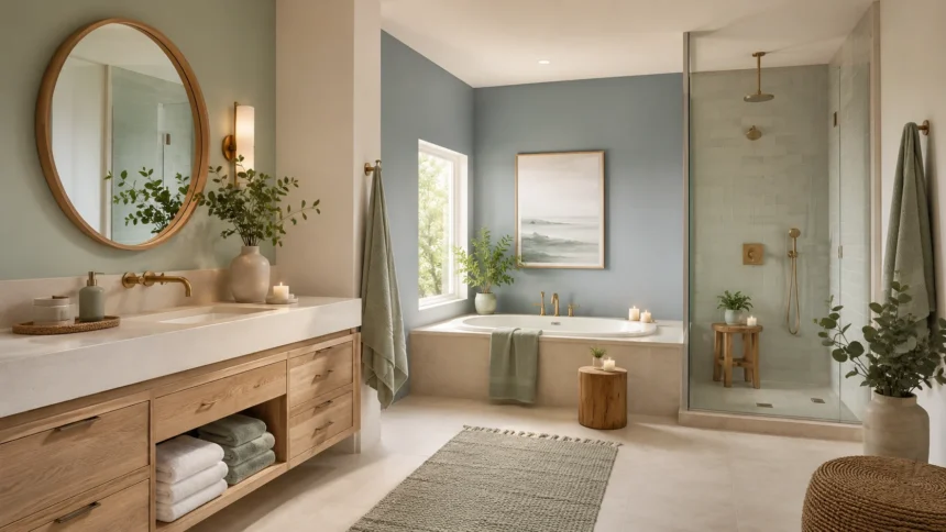
Best Colors for a Calm and Relaxing Bathroom
A bathroom is more than a functional room where you begin and end your day. With the right colors, it can become a calm retreat where you can slow down, reset, and enjoy a few quiet moments. Choosing the best colors for a calm and relaxing bathroom can make even a small or ordinary space feel noticeably more peaceful.
Color influences how a room feels because different shades affect brightness, warmth, visual balance, and overall atmosphere. Soft blues can create a refreshing mood, muted greens introduce a connection with nature, and warm neutrals make a bathroom feel comfortable rather than clinical. The most successful color schemes usually avoid visual overload and create an easy sense of harmony.
However, selecting a relaxing bathroom color is not simply about choosing the palest paint sample available. Natural light, artificial lighting, tile, countertops, cabinetry, flooring, and metal finishes can all influence how a shade looks once it is applied. A color that appears warm in one bathroom may feel cooler or darker in another.
Whether you are renovating an entire bathroom or simply repainting the walls, this guide explores the most calming bathroom colors and explains how to use them effectively. From gentle blues and earthy greens to sophisticated beige and warm white, these ideas can help you create a space that feels comfortable, timeless, and genuinely relaxing.
Why Bathroom Color Matters More Than You Think
Bathrooms are often relatively small rooms, meaning wall color can have a particularly noticeable effect on the atmosphere. Unlike an open living area where furniture and textiles dominate the view, bathroom walls are frequently surrounded by hard surfaces. The right color helps soften those surfaces and create visual balance.
A calming bathroom color palette can also make daily routines feel less rushed. Soft, understated colors tend to provide a quieter visual background than intense contrasts or highly saturated shades. This can be especially appealing in a room used for morning preparation, evening showers, skincare routines, and long baths.
Color also influences how spacious the bathroom appears. Light colors tend to reflect more available light and can make compact spaces feel open and airy, while deeper shades can create intimacy and sophistication. Neither approach is automatically better; the correct choice depends on the atmosphere you want and the amount of light available.
The most relaxing bathrooms usually have a sense of continuity between walls, fixtures, flooring, textiles, and accessories. Instead of introducing numerous unrelated colors, choose a main shade supported by one or two complementary tones. This simple approach creates a cohesive bathroom color scheme that feels intentional without becoming overly designed.
1. Soft Blue for a Fresh and Peaceful Bathroom
Soft blue is one of the most popular choices for a relaxing bathroom because it naturally feels cool, clean, and peaceful. Shades such as mist blue, pale sky blue, dusty blue, and blue-gray can provide color without overwhelming the room. They work particularly well when you want a light spa-inspired atmosphere.
A soft blue bathroom pairs beautifully with white fixtures, light stone, pale wood, and brushed metal finishes. The contrast between gentle blue walls and crisp white elements creates a fresh appearance while maintaining softness. Natural wood accessories can introduce enough warmth to prevent the room from feeling too cool.
Blue also works well in bathrooms with strong natural light because daylight can reveal subtle undertones within the paint. In bathrooms with less daylight, choose a blue with a slightly warm or muted quality rather than a very icy shade. Testing samples before committing can help you avoid an unexpectedly cold result.
For a more sophisticated look, combine pale blue walls with deeper navy or charcoal accents through towels, cabinetry, or artwork. Keep the darker tones limited so they create depth rather than dominating the room. This layered approach gives a simple blue bathroom more personality while preserving its calm character.
2. Sage Green for a Nature-Inspired Retreat
Sage green has become a favorite in relaxing interiors because it combines softness with an unmistakable connection to nature. Its muted gray undertones keep it subtle, making it easier to live with than brighter greens. In a bathroom, sage can create a grounded, refreshing atmosphere that feels comfortable throughout the year.
A sage green bathroom works particularly well with warm white, cream, beige, natural oak, rattan, and stone textures. These combinations reinforce the organic quality of the color and create the feeling of a modern spa. Brass or brushed gold details can introduce warmth without disrupting the peaceful palette.
If your bathroom has plenty of greenery outside the window or contains indoor plants, sage can visually connect the interior with those natural elements. Even bathrooms without much natural light can benefit from the color when it is paired with warm lighting and pale surfaces.
Avoid using too many different green shades within the same compact bathroom. Allow sage to be the main color and support it with natural neutrals instead. This makes the room feel thoughtful and restful rather than overly themed around plants or botanical design.
3. Warm White for a Clean and Comfortable Look
White bathrooms are often associated with cleanliness, but not every white creates a relaxing environment. Bright, cool whites can occasionally feel stark, particularly under strong artificial lighting. Warm white bathroom colors contain subtle cream, beige, or soft gray undertones that produce a gentler and more inviting effect.
Warm white is an excellent option when you want the bathroom to feel bright without introducing obvious color. It also creates a flexible backdrop for changing towels, artwork, hardware, and accessories over time. This makes it especially useful for homeowners who prefer timeless decor rather than frequently repainting.
To prevent a white bathroom from feeling flat, layer several textures into the room. Natural wood, woven baskets, stone countertops, textured towels, matte ceramics, and soft bath mats can add visual interest while keeping the color palette calm.
You can also combine warm white walls with slightly different neutral shades rather than matching everything exactly. Cream cabinets, beige tiles, and pale stone can create subtle tonal variation. These small differences make the room feel warmer and more sophisticated without compromising its clean appearance.
4. Warm Beige for a Soft Spa-Like Atmosphere
Beige has evolved far beyond the dull neutral color people sometimes associate with older interiors. Modern warm beige shades can include subtle undertones of sand, oatmeal, mushroom, or taupe, creating a natural and understated background. These colors work beautifully in bathrooms designed around comfort and relaxation.
A beige bathroom color scheme pairs especially well with travertine, limestone-inspired tile, light wood, brushed brass, and soft white fixtures. Together, these materials create a warm spa-like environment without relying on decorative themes or strong contrasts.
Beige is also forgiving when it comes to lighting. While every paint color changes according to surrounding conditions, warmer neutrals often maintain a comfortable appearance in both daylight and artificial light. This makes beige a useful choice for bathrooms without large windows.
For visual depth, combine several closely related beige tones rather than using one identical shade everywhere. Slightly darker cabinetry, lighter walls, and textured stone flooring can create variation while keeping the overall palette calm and connected.
5. Pale Gray for a Quiet Modern Bathroom
Pale gray can create a peaceful and contemporary bathroom when chosen carefully. The best relaxing gray shades usually contain warm or neutral undertones rather than strong blue undertones, which can make some bathrooms feel cold. Soft greige is another useful option for homeowners who want warmth with a modern edge.
A light gray bathroom works naturally with white porcelain, marble-inspired surfaces, black fixtures, wood cabinetry, and brushed nickel. Because gray is visually restrained, it allows architectural details and materials to become more noticeable without creating a busy atmosphere.
If the bathroom receives limited natural light, avoid choosing a gray that is too dark or cool. A pale greige or stone-inspired shade can provide the same modern appearance while maintaining more warmth. Paint samples should be viewed at different times of day before you make a final decision.
Gray can also serve as a bridge between warm and cool colors. For example, light gray walls can work alongside sage towels, blue accessories, or warm wooden shelves. This flexibility makes gray one of the easiest calming bathroom paint colors to adapt as your decor changes.
6. Dusty Blue for a More Sophisticated Calm
Dusty blue offers slightly more depth than pale sky blue while still maintaining a relaxed appearance. The gray undertones prevent it from feeling overly bright or coastal, making it suitable for traditional, contemporary, transitional, and modern bathroom styles.
This color works especially well when paired with white tiles and medium-toned wood. The combination creates enough contrast to feel interesting without becoming visually loud. Antique brass or polished nickel can also complement dusty blue beautifully.
For a guest bathroom or powder room, dusty blue can add a sense of personality while remaining broadly appealing. Because it is more noticeable than a neutral but less intense than navy, it can make a small room feel intentionally designed rather than simply painted white.
Use warm lighting to bring out the softer qualities of dusty blue. Cooler lighting may emphasize its gray undertones, while warm bulbs can make the room feel gentler. Lighting should therefore be considered part of your color scheme rather than treated as a separate design decision.
7. Soft Taupe for Warm and Understated Elegance
Taupe sits between gray and brown, making it one of the most versatile neutral colors for a relaxing bathroom. A soft taupe shade can create warmth without appearing yellow and sophistication without becoming too dark. It works particularly well in bathrooms where you want an elegant, hotel-inspired atmosphere.
Pair taupe walls with cream towels, natural stone, walnut or oak cabinetry, and warm metallic fixtures. The resulting palette feels layered while remaining restrained. Because all of the colors share earthy characteristics, they naturally work together without creating strong visual contrasts.
Taupe can also help soften bathrooms containing cool gray tiles that might otherwise feel sterile. Introducing a warmer neutral on the walls balances the cooler surfaces and gives the space a more welcoming character without requiring replacement of expensive tile or flooring.
If your bathroom is very small, choose a light taupe rather than a deep brown-gray tone. The lighter version will maintain warmth while reflecting more available light. Deeper taupe can be reserved for cabinetry, towels, or a feature wall if you want additional definition.
8. Pale Lavender for a Gentle and Unexpected Look
Pale lavender can create a surprisingly calming bathroom when the shade is muted rather than highly saturated. Soft lavender-gray or barely-there lilac provides enough color to make the room distinctive while maintaining an elegant and peaceful appearance.
This shade works particularly well with warm white, soft gray, marble-inspired surfaces, and brushed silver finishes. Natural wood can also provide a useful counterbalance by adding warmth and preventing the palette from feeling overly delicate.
Lavender is a good option for homeowners who want relaxing bathroom colors but would prefer something different from blue, green, or beige. The key is selecting a subdued version that behaves almost like a neutral rather than an obviously purple wall color.
Keep surrounding accessories simple so the lavender remains sophisticated. White towels, clear glass containers, neutral rugs, and restrained artwork allow the wall color to provide personality without making the space feel busy or overly coordinated.
9. Cream for a Warm and Timeless Bathroom
Cream offers the brightness of white with additional warmth, making it particularly effective in traditional or cozy bathroom interiors. It creates a soft backdrop that works beautifully with wood, stone, antique brass, woven textures, and natural fabrics.
A cream bathroom can feel especially welcoming in the evening because warm artificial lighting enhances its subtle yellow or beige undertones. This makes it an appealing option for people who use their bathroom as a relaxing space before bedtime.
Because cream can vary considerably between paint brands and lighting conditions, test several shades beside your existing tile and countertops. A cream that looks elegant beside warm stone may appear unexpectedly yellow beside cool white porcelain.
For a modern interpretation, combine creamy walls with clean-lined fixtures and simple accessories rather than traditional decorative details. This contrast allows the warmth of the color to soften the contemporary design while maintaining a fresh appearance.
10. Muted Teal for a Relaxing Bathroom With Character
Muted teal combines qualities of blue and green, making it naturally suited to bathrooms where you want both freshness and depth. Choosing a desaturated teal keeps the effect sophisticated and relaxing rather than bright or tropical.
This color can work beautifully on a vanity, feature wall, or even throughout a smaller powder room. Pair it with off-white, pale stone, natural wood, or warm metallic finishes to balance its richness and maintain a comfortable atmosphere.
If using teal across all four walls, pay close attention to the bathroom’s lighting. Darker versions can create a cozy cocoon-like feeling, while lighter teal shades maintain greater brightness. Both approaches can feel relaxing when the remaining materials are relatively simple.
Muted teal is particularly useful for homeowners who find neutral bathrooms too predictable. It introduces enough personality to feel memorable while retaining the water-inspired quality people often appreciate in peaceful bathroom environments.
11. Soft Greige for the Best of Gray and Beige
Greige blends gray and beige, combining the contemporary appearance of gray with the warmth of beige. This makes it one of the easiest neutral colors to use in bathrooms where existing fixtures contain a mixture of cool and warm undertones.
A greige bathroom can work with white tile, black hardware, warm wooden cabinets, chrome fixtures, and natural stone. Its flexibility allows you to update accessories later without needing to completely reconsider the wall color.
Lighter greige shades are particularly useful in small bathrooms because they create subtle definition without making walls feel heavy. The result is warmer than pure gray but more modern than traditional beige, providing a balanced and understated backdrop.
Greige also layers beautifully with natural textures. Linen-inspired shower curtains, woven storage baskets, pale oak shelving, and textured towels can prevent the neutral palette from feeling plain. The overall look remains peaceful while still offering visual richness.
12. Muted Blush for a Warm and Gentle Space
Muted blush can work surprisingly well as a relaxing bathroom color when it contains beige, clay, or gray undertones. Instead of feeling overly sweet or decorative, these earthy pink shades can create a warm and sophisticated environment.
Combine blush walls with warm white, cream, pale oak, travertine, or brushed brass. These materials reinforce the warm undertones and create a soft color scheme that feels contemporary rather than overly traditional.
Muted blush can be particularly effective in bathrooms with little natural warmth. If white tiles or stone surfaces make the room feel cold, a gentle pink-beige wall color can introduce warmth without making a dramatic visual statement.
Keep accessories relatively neutral to preserve the calming mood. Cream towels, natural baskets, and minimal artwork create enough balance while allowing the blush walls to provide subtle personality. Avoid introducing numerous additional pink shades, which can make the design feel overly coordinated.
13. Earthy Sand for a Relaxed Organic Bathroom
Sand-inspired colors draw from beaches, natural stone, clay, and warm earth, making them ideal for bathrooms influenced by organic design. These shades usually sit somewhere between beige and light brown, creating a grounded and reassuring atmosphere.
Pair sandy walls with stone-look tile, oak cabinetry, woven baskets, and off-white textiles to build a natural bathroom palette. Matte finishes tend to reinforce the organic quality more effectively than overly glossy decorative surfaces.
Sand colors also work particularly well when the bathroom connects visually with an outdoor environment. Natural daylight can highlight the warmth of the shade and create a smooth transition between interior and exterior tones.
For contrast, introduce small amounts of black, bronze, or deep brown through lighting and hardware. These darker details can define the space without disrupting the calm neutral palette. The result feels warm, contemporary, and understated.
14. Soft Olive Green for a Deeper Natural Look
Soft olive green provides more depth than sage while retaining the relaxing qualities associated with earthy colors. Muted olive shades work particularly well in bathrooms featuring natural stone, dark wood, or traditional architectural details.
Because olive contains warmer undertones than many greens, it can create a cozy atmosphere rather than feeling cool. Pairing it with cream, beige, brass, and walnut creates a rich palette suitable for bathrooms where relaxation means warmth and intimacy rather than maximum brightness.
Olive can also work as an accent color if you are hesitant to use it across every wall. A painted vanity, tiled shower niche, or single feature wall can introduce the shade while keeping the rest of the bathroom light.
For smaller spaces, choose a softer olive with noticeable gray undertones. This reduces the visual intensity while preserving the organic character. Larger bathrooms can comfortably handle deeper versions when supported by good natural or artificial lighting.
15. Charcoal for a Cozy and Dramatic Bathroom
Dark colors are not automatically stressful or unsuitable for relaxing spaces. A carefully designed charcoal bathroom can feel intimate, quiet, and cocoon-like, particularly in powder rooms or bathrooms where the goal is atmosphere rather than visual expansion.
Charcoal works best when balanced with warmer materials such as wood, brass, beige stone, or soft white textiles. These elements prevent the darker walls from feeling harsh and introduce enough contrast to maintain visual clarity.
Lighting becomes particularly important with deeper colors. Wall sconces, layered lighting, and reflective mirrors can keep the room functional while preserving the cozy mood. Relying on a single harsh ceiling fixture may make dark surfaces feel less comfortable.
If painting every wall charcoal feels too dramatic, use the color on cabinetry or one accent wall. Combined with warm white or greige elsewhere, it can introduce sophistication and depth while keeping the overall bathroom color scheme relaxing.
How to Choose the Right Relaxing Bathroom Color
Begin by considering how much natural light your bathroom receives. North-facing or windowless bathrooms may benefit from warmer neutrals, while bright spaces can often handle cooler blues and greens without feeling cold. Lighting should influence your decision as much as personal preference.
Next, examine the permanent surfaces already in the room. Tile, countertops, flooring, baths, sinks, and cabinetry contain undertones that affect how paint colors appear. Choosing a wall shade that complements these materials creates a more harmonious result than selecting paint in isolation.
Think about the mood you personally associate with relaxation. Some people feel calm around cool watery blues, while others prefer the warmth of beige, taupe, or cream. Your bathroom should reflect the environment that makes you comfortable rather than following a color trend simply because it is currently popular.
Always test several paint samples directly in the bathroom before making your final choice. Look at them during morning, afternoon, and evening lighting. A shade can change significantly throughout the day, and testing helps ensure the final result feels relaxing under the conditions you actually experience.
Best Colors for Small Relaxing Bathrooms
Light colors are often useful in small bathrooms because they help maintain brightness and visual openness. Warm white, light greige, pale blue, sage, and soft beige can all make compact spaces feel calmer and less visually crowded.
However, small bathrooms do not always need to be painted white. Using one muted color throughout the room can actually reduce visual fragmentation and create a more cohesive atmosphere. Soft green or dusty blue can make a compact bathroom feel intentionally designed.
Keep strong contrasts relatively limited if spaciousness is your goal. When walls, trim, cabinetry, and tile are close in tone, the eye moves around the room more smoothly. This can make the boundaries feel less pronounced and the overall space more serene.
Mirrors, effective lighting, minimal clutter, and thoughtful storage will also influence how spacious the bathroom feels. Color works best when combined with these practical design choices rather than being expected to transform the space by itself.
Best Color Combinations for a Spa-Like Bathroom
Sage green and warm white make one of the easiest spa-inspired combinations. Green provides a natural element while white maintains freshness and brightness. Add pale wood and textured towels to complete the relaxing effect.
Soft blue and sandy beige can create a similarly peaceful palette inspired by coastal environments without becoming overtly nautical. Use blue on walls and introduce beige through flooring, baskets, or towels to create warmth.
Greige and cream provide a more neutral approach. These colors work well for homeowners who want a sophisticated bathroom that feels calm without introducing noticeable blue or green tones. Stone and wooden elements can add further depth.
For a richer spa atmosphere, pair muted olive or teal with warm beige and brass accents. Keep patterns restrained and repeat the same materials throughout the space. Consistency allows deeper colors to feel luxurious instead of visually overwhelming.
Colors to Use Carefully in a Relaxing Bathroom
Highly saturated red can feel energetic and dramatic, which may conflict with the peaceful atmosphere many people want in a bathroom. If you love red, consider introducing muted terracotta, clay, or rust accents rather than covering every wall with a vivid shade.
Bright yellow can create cheerful energy but may become intense under strong bathroom lighting. Softer buttery or cream-based versions can provide warmth without creating the same level of visual stimulation.
Pure black can look striking, although large amounts may make some bathrooms feel heavy. Using black selectively through fixtures, mirror frames, or cabinetry creates definition while allowing softer colors to remain dominant.
Neon or extremely saturated colors can also become visually tiring in a small enclosed space. There are no absolute rules in interior design, but if your primary objective is relaxation, muted and balanced shades generally provide a more restful foundation.
How Lighting Changes Bathroom Paint Colors
Natural and artificial lighting can dramatically change how bathroom colors appear. A warm beige may look almost creamy in sunlight but deeper under evening lighting, while a pale gray may reveal blue or green undertones that were not obvious on the paint sample.
Bulb temperature matters as well. Warmer light can make beige, cream, taupe, and earthy greens feel especially inviting, while cooler light may emphasize blue and gray undertones. Matching your lighting to the atmosphere you want can improve the final color scheme.
Bathrooms with little natural light require particular attention because artificial lighting determines the appearance of the room for most of the day. Test samples under your existing fixtures before purchasing large quantities of paint.
If possible, use layered lighting rather than one harsh overhead source. Vanity lights, wall sconces, and ambient lighting can create softer illumination while also helping your chosen colors appear more dimensional and comfortable.
How to Create a Calm Bathroom Beyond Wall Color
Color provides the foundation, but clutter can undermine even the most peaceful palette. Keep countertops relatively clear and organize everyday toiletries inside drawers, cabinets, trays, or baskets. A visually quiet room generally feels calmer than one filled with numerous products.
Texture also contributes significantly to relaxation. Soft towels, natural wood, woven baskets, stone surfaces, and simple fabrics can make a neutral bathroom feel warm rather than empty. These materials add interest without requiring more colors.
Keep decorative accessories restrained. A small plant, framed artwork, ceramic soap dispenser, or vase can introduce personality without overwhelming the room. Leaving some surfaces intentionally empty gives the eye somewhere to rest.
Finally, consider practical comfort. Good ventilation, pleasant lighting, clean fixtures, enough storage, soft towels, and a comfortable temperature influence relaxation just as much as paint. A beautiful bathroom becomes truly calming when it is also easy and pleasant to use.
Common Bathroom Color Mistakes to Avoid
One common mistake is selecting paint based only on how it appears online or on a small color card. Every bathroom has different lighting and surrounding materials, meaning the same shade can look dramatically different once applied to your walls.
Another mistake is mixing too many unrelated undertones. Cool gray walls, yellow-beige tile, bright white fixtures, and orange-toned wood may compete visually. Identifying whether your existing materials lean warm, cool, or neutral can help you create better harmony.
Avoid assuming that every relaxing bathroom must be extremely pale. Medium and even dark colors can create beautiful, peaceful spaces when lighting, materials, and contrast are handled carefully. The emotional effect of a color often depends on the entire room rather than its brightness alone.
Finally, do not choose a color purely because it is trending. Trends can offer inspiration, but you will interact with the bathroom every day. A shade you genuinely find soothing is more valuable than one selected simply because it appears frequently in current interior photographs.
Final Thoughts on the Best Colors for a Calm Bathroom
The best colors for a calm and relaxing bathroom are shades that create visual balance while making you personally feel comfortable. Soft blue, sage green, warm white, beige, greige, taupe, cream, and muted earthy colors are excellent starting points because they provide character without overwhelming the room.
Consider lighting, room size, existing materials, and your preferred design style before making a final choice. A calming bathroom does not require every surface to be pale or neutral; deeper colors can also feel restful when used thoughtfully and supported by warm materials.
Remember that the entire palette matters more than one individual wall color. Towels, flooring, cabinetry, tile, fixtures, artwork, and accessories should work together rather than compete for attention. A limited color scheme usually creates the strongest sense of harmony.
Ultimately, your bathroom should provide a comfortable transition into and out of your day. By choosing gentle colors, natural textures, good lighting, and uncluttered styling, you can transform even a basic bathroom into a peaceful space that feels closer to a private spa.
Frequently Asked Questions About Relaxing Bathroom Colors
What is the most relaxing color for a bathroom?
Soft blue, sage green, warm white, beige, and greige are among the most relaxing bathroom colors. The best choice depends on your lighting, fixtures, and whether you prefer a cooler or warmer atmosphere.
What colors make a bathroom feel like a spa?
Sage green, warm white, sand, beige, soft gray, and muted blue can create a spa-like bathroom. Pair them with natural wood, stone textures, soft lighting, and simple accessories for a more relaxing effect.
What is the best relaxing color for a small bathroom?
Pale blue, warm white, light greige, sage, and soft beige work particularly well in small bathrooms. They maintain brightness while adding enough warmth or color to prevent the room from feeling sterile.
Are dark colors good for a relaxing bathroom?
Yes. Charcoal, deep teal, olive, and other muted dark colors can create a cozy, calming atmosphere when balanced with good lighting, warm materials, and lighter textiles.
Should bathroom walls be lighter than the floor?
They do not have to be, but lighter walls paired with slightly deeper flooring can create a grounded and spacious appearance. Similar tonal colors can also produce a seamless, peaceful bathroom design.